










1. Tone-on-Tone Decorating: The Secret to Structuring Monochromatic Rooms with Material Mix
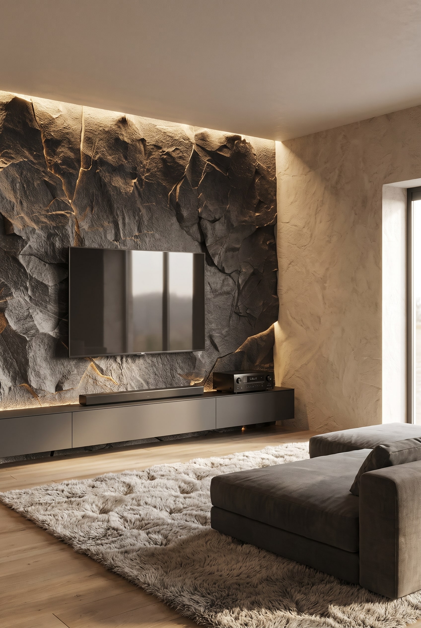 Product shown true to original. Room styling created by digital staging.
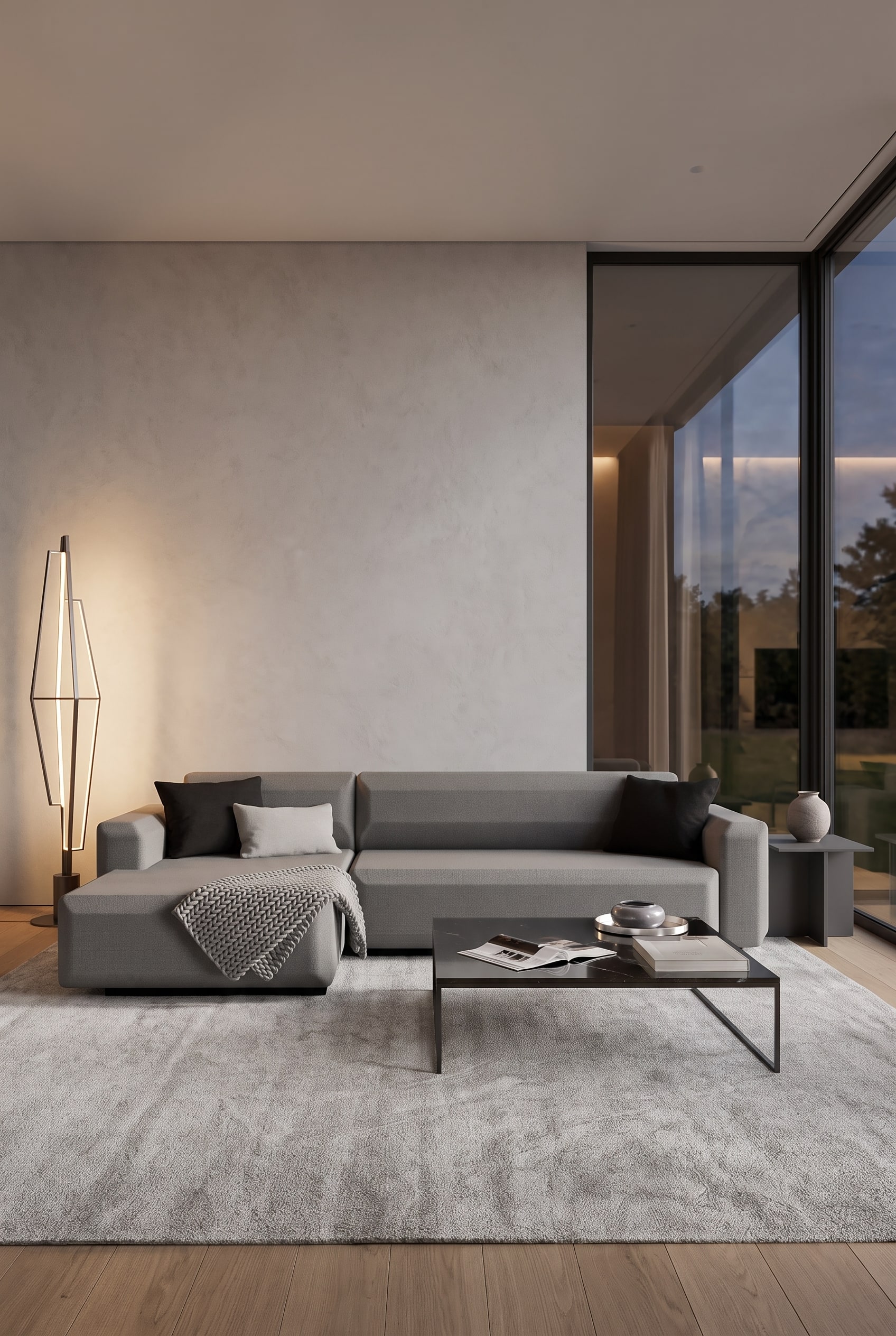
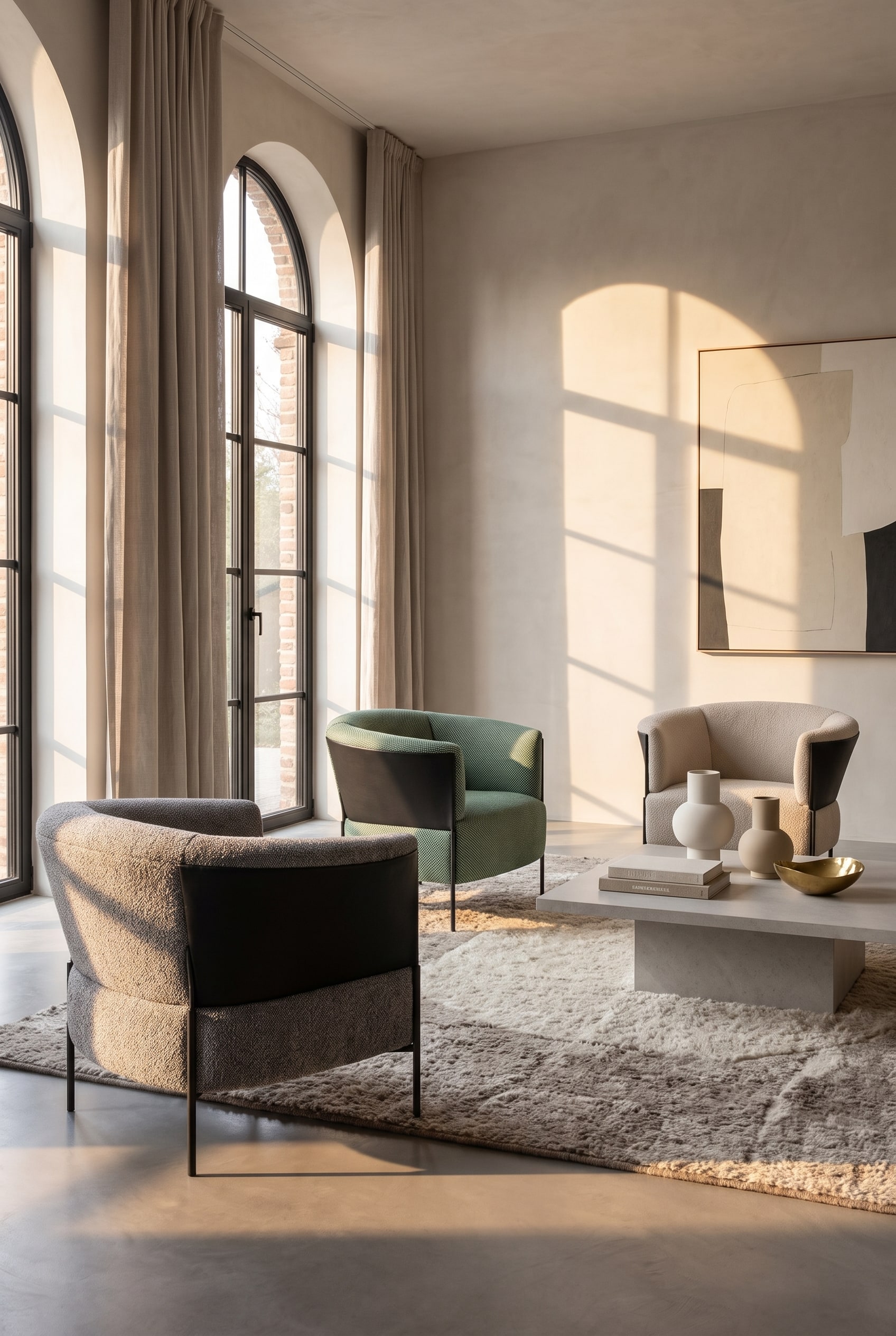
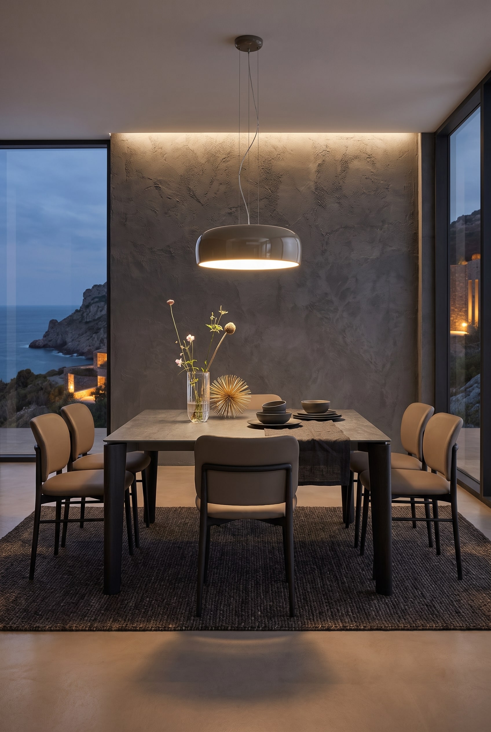
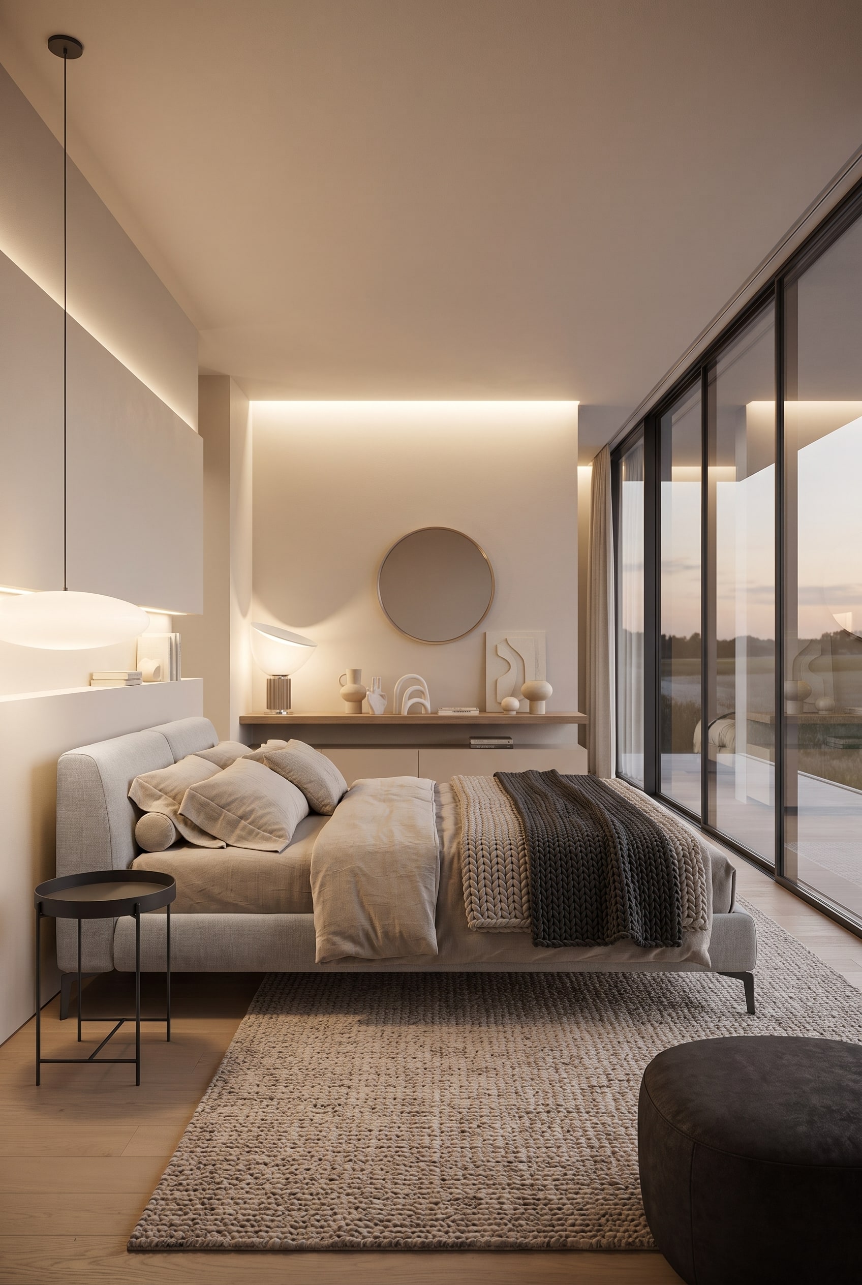
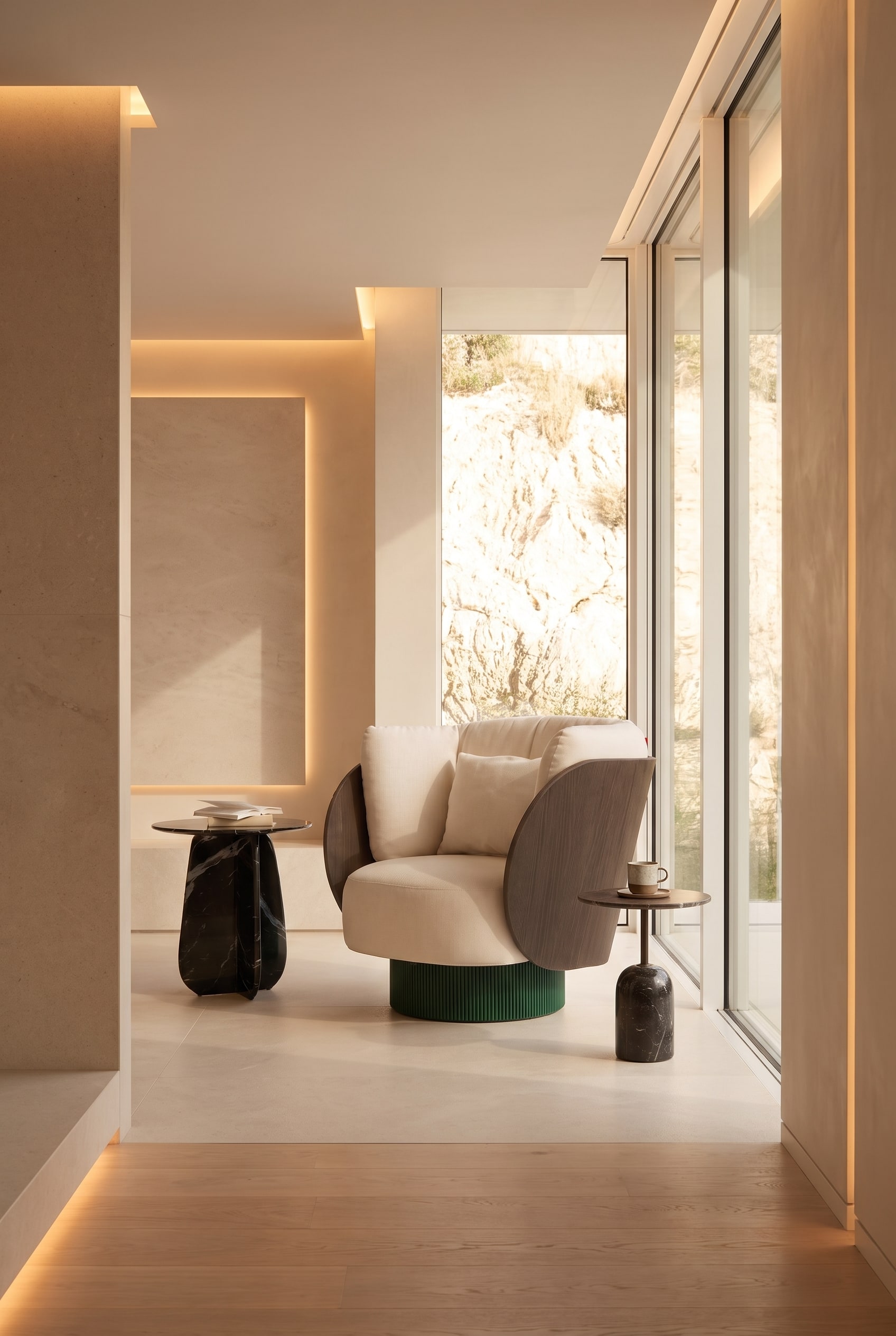
The biggest misconception in monochromatic design is the assumption that all surfaces must have the same finish. In fact, extreme tactile variance is essential for the eye to perceive the room's boundaries. If wall paint, carpet, and the central seating furniture have exactly the same colour value, they merge into a shapeless surface without texture. The solution lies in the deliberate juxtaposition of smooth and textured materials that reflect ambient light completely differently.
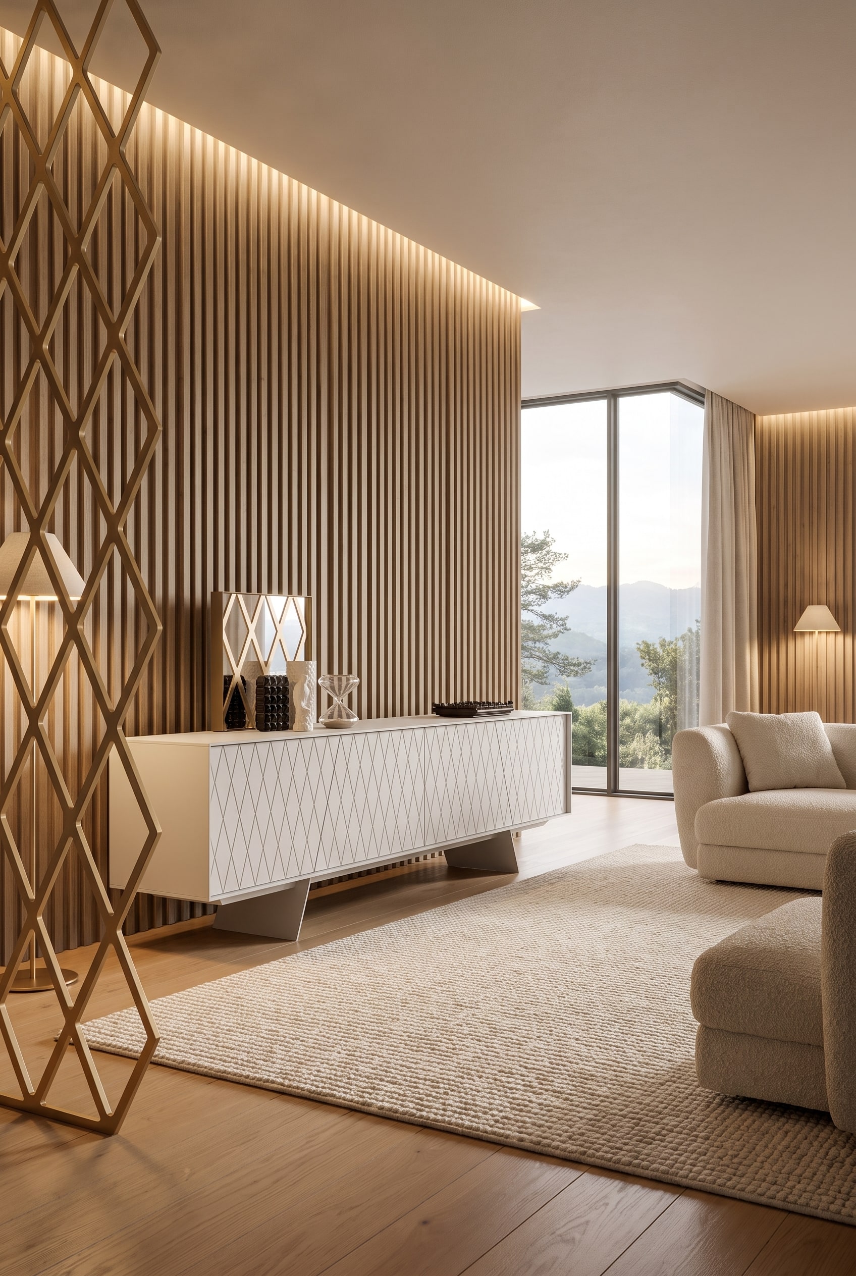
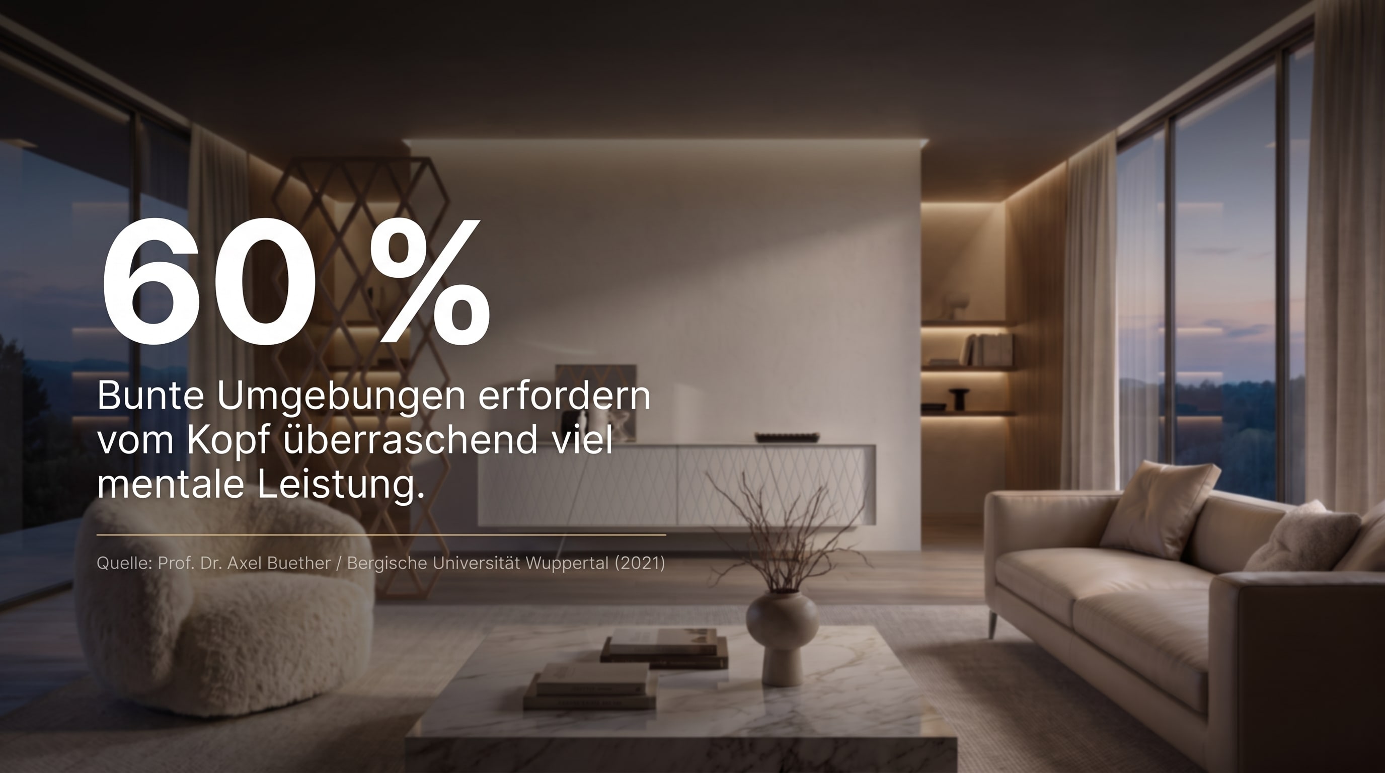
An excellent example of this effect is the integration of smoothly lacquered cabinet furniture into an otherwise soft, textile environment. A clear, architectural furniture front catches the light at its edges, creating a subtle yet precise highlight in the room. If this is combined with a deep wool rug or walls with a rough lime plaster finish, a palpable tension arises. The cabinet furniture stands out from the background without breaking the room's calm colour harmony. It is a technique also described in detail in our article on Modern Retro Luxe Living Ideas, where warm textures ground cool surfaces.
Livarea Expert Tip:Within a colour family, always mix at least three different texture categories – for example, something soft (velvet or wool), something cool (stone or metal), and something smooth with a fine reflection (lacquer or wood). This immediately creates architectural depth.
Furniture Tip for Smooth Accents: The Livitalia Box Lowboard Configurator allows you to introduce visual structure into monochromatic living rooms through individually selectable lacquer finishes. Its smooth fronts form a perfect architectural counterpoint to soft, textile furnishing elements.